This Thing of Paper: Design Considerations
I introduced This Thing of Paper last week. This week I am writing about the work that went into the design process and how I defined the design vocabulary. If you like reading about how designers' brains work, this post will definitely give you a glimpse into my way of working! 
Work on This Thing of Paper started some time in 2012. I began talking to friends and colleagues about this mad notion I had: I wanted to make a knitting collection by hand like a medieval scribe. The practicalities made me abandon this idea: I am a semi-competent calligrapher, but making a whole book by hand* would have taken me years. Also, pattern support would have been interesting ("Let me send you a handwritten letter about row 97") and the idea of inserting errata was daunting.
*) manuscript literally translates as something 'written by hand'!
As it happens, though, I have a background in book history and as the idea of making a book by hand left me, I began thinking about the shift from manuscript to printed book. I knew I'd have enough material to write about but I had to find out if I had design material.

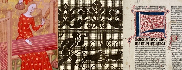
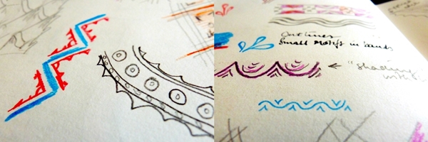
I set up a moodboard. I browsed digitalised archives of books from the period. I visited art galleries & museums (and one of my local museums was even kind enough to have a relevant exhibition!). I sketched and examined sources from 14th century Book of Hours manuscripts to 16th century embroidery manuals.
Keywords emerged as did a distinct colour palette and design vocabulary.
The colour palette was fairly easy to conceptualise: parchment and paper with ink and decoration. Soft natural shades with rich, deep mineral-derived pigments. Below you can see some fairly typical details from 14th century illuminated manuscripts and how they translate into colour palettes. Contrary to what many people believe, though, most manuscripts were not highly decorated. As time progressed, technology allowed for woodcuts to be inserted into printed pages - some were tinted by hand afterwards.

Related: here is an an excellent article about why it is impossible to replicate the colours of medieval stained glass.
The design vocabulary was harder to capture. I had worked with such a sparse design vocabulary for Doggerland that I was overwhelmed by the visual possibilities in This Thing of Paper. Dragons! Devils! Stars! Acanthus leaves! Overwhelmed.
Instead I began to fall in love with the concept of negative space. Paper being much cheaper than vellum meant that you did not need to cram as much information as possible into a page; margins became wider and spaces between words appeared! I'll be writing much more about this in the actual book - but how things relate to one another in a confined visual space definitely became a thing for me. I also fell for small geometric motifs and how things are visually repeated in different ways.
So, the design vocabulary is much more exuberant than it ever was for Doggerland, but it does not mean I have not edited it ruthlessly. I am placing the visual cues in a 21st century context with wearability at the forefront. Less rustic garterstitch and pared-down lace; more play with colour and delicate, ornamental motifs.

Further design considerations: I wanted items that would appeal to a range of knitters. The projects are aimed at advanced beginner knitters to advanced knitters. Some projects will be achievable in a weekend or over a week; others will demand more involvement. The items cover texture, colour and lace. Needing to include such a variety of things in a relatively small collection meant editing what I needed to design.

For structure, I divided This Thing of Paper into three sections (or three main stories, if you like) and each section includes a garment as well as accessories. Each of the three garments will be graded across seven sizes (XS to 3X) and will have notes on how to modify fit. The accessories are a mixtures of shawls, hats and gloves. I'll be including sizing options here as well. Most patterns will be both charted and written out, because I know many people prefer to work from both (the jury's out on one shawl pattern, but I will keep you updated on that).

Thank you so, so much for all the enthusiasm and excitement so far. This is already a long entry but I want to tell you how much your reaction has meant to me. At the risk of sounding corny, I genuinely feel like I'm not alone on this whole This Thing of Paper journey because you are all sharing this adventure with me. I know this may sound like one of Those Inspirational Quotes I usually wince at - but I genuinely mean it. It is so nice to have you along.
Next week I will be writing about all the practical stuff (but there will still be pretty colours & images).