HOW TO CREATE A KNITTING MAGAZINE SUBMISSION
I help others select and curate collections for books and magazines. So, I thought it might be interesting to show you one of my successful submissions and discuss how I put together a magazine sub.
If you want to go more in depth, I run classes on how to pitch to editors and find your design audience.
My Tula hat & gloves set made the cover of UK knitting magazine Let's Knit.
The set looks like this (photo courtesy of Let's Knit):
Now let's look at the original submission
Let's dissect the sub.
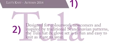
1) I personalised the sub by adding the name of the magazine.
Occasionally magazines will give you "stories" or moodboards they want you to use. If that's the case, I will usually add the name of the relevant moodboard to signal that I have thought about my design in a particular context. Let's Knit didn't give me a moodboard to work from, just general guidelines.
2) The name is short, easy to spell and relevant. I wrote a brief note about the design/design inspiration. Always try to do this in one or two sentences. This brief note should tell the editor(s) exactly what they are looking at.
Next, the details that tell the editors I have thought through the design and who it will appeal to.
3) The section on construction is very important to tech editors. They will look at whether the designer has thought through the actual making of the piece(s). Nobody wants to commission a piece which the designer realises is impossible to make three weeks before deadline.
4) Depending upon the type of swatch and my lead-in sentences (2), I sometimes skip the design elements. However, it is useful to give an actual description of the piece(s) and this will help the editors when writing about the piece in the magazine as they may not have photos of the item handy when they write about them.
5) The yarn suggestion section is often really fun to compile, but I make sure the yarn suggestions are a) available in the country of the publication, b) they are current yarns and c) they are relevant to the actual project (i.e. not just stuff I think it'd be fun to use).
My Tula swatch was knitted in Rowan Felted Tweed which has beautiful drape and comes in 29 colours. It is a sportweight yarn which meant I could actually dip into 4ply or light DK when it came to making substitutions. I selected Jamiesons of Shetland Spindrift (4ply) and Drops Alpaca (sportweight) as possible substitutions - both have beautiful drape and great colour ranges. Let's Knit loved my idea of using Jamiesons - and I loved using it.
Note that I am not making any colour suggestions! The editors often work to colour stories and will liaise with me to make sure my design fits into their stories.
6) Difficulty level simply shows that I have considered who might want to knit my design.
Tula is charted and is knitted in the round - this coupled with gentle colourwork says that it will not appeal to absolute beginners but may be an aspirational knit for adventurous beginners or intermediate-level knitters.
Again, I am also considering the publication and its target audience. Knitters are not a homogeneous bunch nor are magazines!
7) Sketch of fit. I want this to show how the hat sits on the head of the wearer and the shape of the fingerless mitts.
I know sketching is hard for some people, but you can trace fashion models (like this tutorial tells you) and there are many free tracing models out there. The more you practice, the better you will get. Remember: if doesn't matter if your model only has three fingers and she squints if your sketch communicates how a hat fits!
8) However, the swatch is very, very important. The swatch is where the entire story is told, really. Your swatch needs to be relatively big (4" by 4" or preferably bigger), blocked, and incorporating all the important elements.
Here you can see Tula's one-row cast-on and cast-off in a contrast colour, the 1x1 rib and both colourwork patterns (and how they call back to each other). The photo was taken in daylight near a window (so all details are clear) and I photographed the swatch on a neutral background. Sometimes I take a series of photos of details like beading or a particular stitch pattern and I put them next to the main photo - but only if they are important to the story.
9) Finally, the bit where I tell editors about me. Quick intro to my background, a paragraph about clients and collaborators, a note about my personal design aesthetic, and finally how the editors can get hold of me including my home address so the editors can send me yarrrrn.
The design is way more important than me, so I'm in the margins!
Not everybody has a portfolio full of clients and collaborators, but think of your Ravelry project page as an online portfolio. I got my first big break in the knitting industry after someone had seen my project page, actually, and I always check out what people have been knitting. Someone may not have many designs to their names but they may have a project page full of stunning work where they reveal a real sense of colour. Instagram is another brilliant place to showcase your skills.
I spell-check before turning my single A4 page into a PDF (I don't want to write nkitting and nedles - tech editors will worry I cannot format a pattern!). Note that I have chosen to use colours in my layout - I change these colours for every sub I compile so they reflect the colours used in my swatch. Partly it's because I am quite obsessive about colour, but also partly because my choice of colour/layout is part of the story I am telling with my sub. You can also see I choose to semi-bold keywords which makes life easier for a busy editor.
And there you have it - the sub I compiled for Tula. I hope this has been useful in showing you just how much information I try to include and how I try to make the editors' decision-making easier. And all on one page.
This is definitely not the only or right way of making a submission - remember you want to be telling your own story in your own voice! Still, it should give you some ideas.
Any questions, just get in touch.


