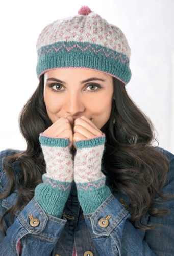
 What a lovely surprise I got this morning. We are having family visiting due to Glasgow hosting the Commonwealth Games and as soon as they left for another day of sports, I sat down to check my inbox. And then I started giggling.
I just got my first cover, folks, and I had no idea it was happening.
Several months ago, I was approached by the lovely people at Let's Knit magazine. They commissioned me to design a hat/gloves set celebrating my Scandinavian heritage. I also did an interview with them talking about my family background, how I got into designing, and why I am passionate about getting other people thinking about crafts.
And I started out sketching my design.
I was watching a film from the early 1930s when the initial idea came to me, so I knew I wanted a 1930s colour scheme. I had just finished working on a big colourwork project so I used the left-overs for the swatch but I already knew the green wasn't quite right. I needed a cooler seafoam green. Next came the idea to do very, very straightforward colourwork. I picked some of my favourite motifs and played with them until I had some simple, fun motifs I could scatter across my canvas. I drew upon my knowledge of Faroese knitting which is more geometric than Shetland colourwork - and I ended up with something that was super-cute and super-fun .. even for people who are not that confident at colourwork.
I was very lucky that my Let's Knit editor was onboard with my ideas very quickly and knew what I meant about getting the right colours. Sarah suggested looking at Jamieson's Spindrift which is a wonderful British yarn that comes in a myriad of colours. I have used Spindrift before and it knits up beautifully. The pattern only uses three colours, so working out a colour scheme is relatively easy.
Let's talk colour substitution. I would suggest looking at it the following way:
Neutral Background - make sure to match this colour in terms in warm/cool undertones. My sample used Pebble, a white with a cool, grey undertone
Main Contrast - make sure to choose something that makes a statement as it'll dictate the overall look of the knit - the sample used Eucalyptus, a cool seafoam green with a grey undertone
Second contrast - make sure this matches the other two colours but make sure it doesn't take over the entire look - the sample used Sorbet, a cool mid-range pink with a grey undertone.
![794-eucalyptus-386-p[ekm]185x184[ekm]-horz](http://static1.squarespace.com/static/5952aea7b11be182d288f50c/59ba75768e62d69316542a6a/59ba757d8e62d69316542f89/1505391997427/794-eucalyptus-386-pekm185x184ekm-horz.jpg?format=original)
Here is a warm version (using Granny Smith, Lipstick and Mooskit) - it feels less vintage and more playful:
![1140-granny-smith-269-p[ekm]185x185[ekm]-horz](http://static1.squarespace.com/static/5952aea7b11be182d288f50c/59ba75768e62d69316542a6a/59ba757d8e62d69316542f8d/1505391997430/1140-granny-smith-269-pekm185x185ekm-horz.jpg?format=original)
Or maybe a slightly more modern colour scheme? You will still get the contrast but with a dark background (Yellow Ochre, Eesit and Shaela):
The colour combinations are endless. This is partly what I love about colourwork - you get to paint with yarn.
I cannot help but feel that autumn is on its way - I am utterly delighted to have secured the cover of Let's Knit and I can see many other new patterns are heading out into the world right now. I love this time of the year.

 Summer is always one of the busiest periods of my working life as magazines are commissioning items for their autumn/winter issues. I have just finished the last of my many commissions and am now looking forward to getting stuck into the self-publishing side of my life. I have been asked many times how I go about doing what I do, so here's a little run-down.
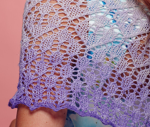

 What a lovely day.
The postman brought me the April issue of UK knitting magazine
  I continue to be chuffed about my
 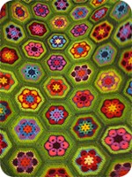 I want to share a project made by a friend from my knitting group. I was lucky enough to see
 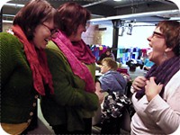 My main knitting group is actually so big that it has several divisions: I met the blanket maker when I happened upon the South Side division at the Tramway. I was only there to take down my knitted sculpture but was very, very pleased to see so many familiar and lovely faces. My partner was on hand to help me and was so amused by what he called "a tribal encounter" that he had to take a photo..