Purls

Pattern: the Chinese Kites Shawl

September 2014 155Chinese Kites was originally printed in a UK magazine last year. Rights reverted to me around the start of this year and I just added "release CK" to my massive to-do list. You know what those lists are like; they are a big black hole and no matter how many boxes you tick, that list just keeps getting longer.

Then I realised the shawl is perfect for teaching a lot of things.

I use it when I teach beading techniques because it has optional levels of beading, uses one specific technique (the crochet hook method) and there are reasons why you cannot use other methods. I use it when I teach crochet because it has an optional crochet cast (the pattern includes a knitted cast-on too) and people often don't realise how effective an easy crochet cast-off looks when knitting lace. Finally, I use it when I teach lace knitting and lace shawls. I explain the construction and the design decisions involved in the shawl.

Basically, Chinese Kites is a fun shawl to knit - and it is very pretty too. So many students has come up to me and asked where they could buy the pattern, and that's when I decided I needed to move "release CK" to the very top of that big, scary to-do list.

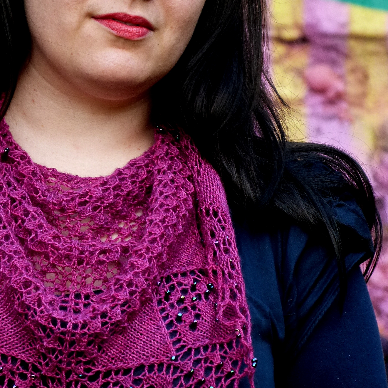
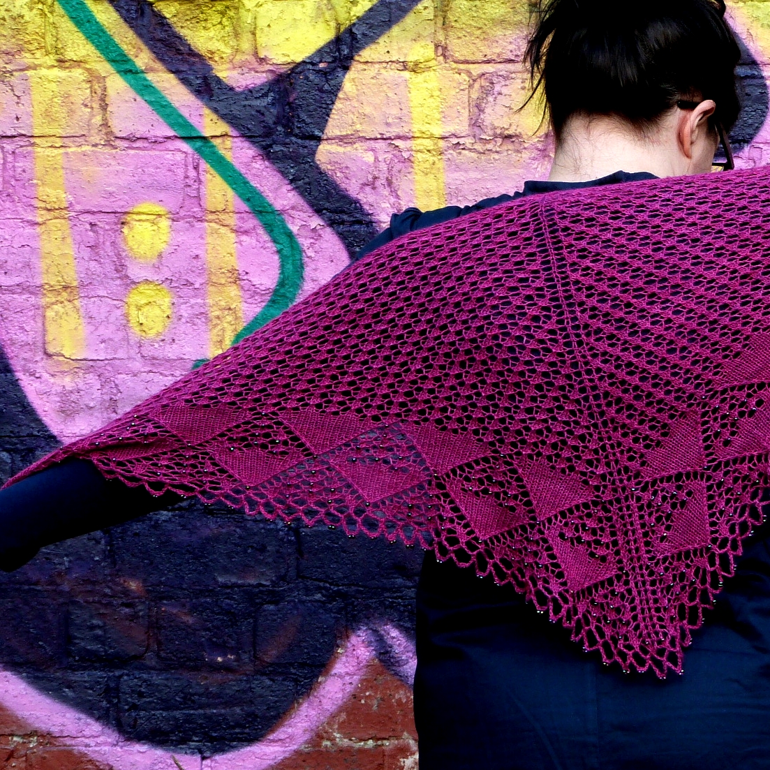
The shawl is inspired by a a photo of competitive kite flying in the Chinese region of Weifang. I saw it at a photo exhibition and the explosion of colours and forms stayed with me. I began thinking about how I could translate this image into knitting and this is the result. September 2014 157 There are a lot of triangles in this pattern - that was a big design decision for me. There are five different types of triangles.

1) The shawl is one big triangle

2) and that big triangle consists of two smaller triangles

3) then you have the big triangular 'kites' flying around the border

4) on top of a field of small triangles

5) and, finally, the crochet border blocks into a neat row of small triangles

(that's how my design brain works, folks)

The shawl is knitted in a luscious, luscious BFL 4ply/fingering from Eden Cottage Yarns. I wanted a rich, deep and dramatic jewel colour and Vikki of ECY came up trumps with her Fuchsia colourway. It is an incredible semi-solid - it doesn't look it in the skein, but it shimmers subtly from one shade to another when you knit. I was deeply impressed.

(Psst, you can actually see the shawl 'live' at the ECY stall at the Ally Pally show this week)

The low-down: The Chinese Kites Shawl is now available to download for £3.00 It uses between 400 and 430 yrds of 4ply/fingering yarn (watch your gauge) 4mm needles / 0.75mm crochet hook (for beads) / 4mm crochet hook (for crochet cast-off) You'd need between 0-500 beads depending upon your beading preferences Difficulty level depends upon whether you decide to use beads and/or the crochet cast-off.

I still have a backlog of previously released patterns but I swear I'm working through them as fast as I can (whilst also working on new patterns). Hope you'll enjoy knitting Chinese Kites and that you'll have fun choosing colours.

Knitting, Needles and Wednesday News (Of Sorts)

September 2014 012 I have had a hectic start to September, so I am pleased that I am spending most of today knitting a sample. I am trialling some new-to-me knitting needles - you can see the KnitPro Nova Cubics in the photo - but I'll write more about the needles once I've had a chance to trial the other ones. My tool kit is so important to me; good needles make all the difference if I am knitting to a deadline and I cannot rely on one type of needle to work for every kind of knitting. I'm knitting my current sample in Malabrigo Rios that I got from Love Knitting - it's a yarn that definitely needs a smooth needle with a blunt tip.

It's been a while since I had a chance to do a real round-up, so here we go!

+ I went north-north-north to the quirkiest, most delightful yarn shop I have seen in ages, Fluph. I taught a class on lace shawls but we deviated a bit from the script as most of the students were textile students who wanted to understand how to design lace as much as they wanted to understand how to knit shawls. So, we talked charts, fabric bias and how to position lace within a given shape. Good times with bonus dog cuddles at the end.

+ Glasgow University is hosting another Knitting in the Round seminar - this time on Sanquhar gloves. It's "an informal public event to explore Sanquhar knitting – its history, its current popularity, the skills required, the wool needed and the patterns recorded" - November 1, 11am-3pm, Sanquhar in Dumfriesshire.

+ A couple of workshop dates have been added: Glen Gallery Crafts in Cullybackey, Northern Ireland is hosting me for two workshops on Nordic colourwork knitting on November 14 and 15. Before then I will be at McAree Brothers in Stirling on November 8 running a lace workshop in support of The Knit Generation (I'll tell you more about the book later).

+ Finally, there's an interview with me over on the Playful Blog today. I talk about what it's like being a freelancer and I give my top 3 tips on how to make an impact in the fibre industry. Ms Playful and I are hosting a Twitter hang-out on September 9 where a panel of industry experts will be on hand to give their tips on how to make the leap. You won't believe who we got lined up for this hang-out. Chills.

+ I am heading down to spend time on Susan Crawford's farm next week, so I will make sure to take lots of photos from this inspirational place and hopefully I will also be able to share a sneak preview from Susan's forthcoming book. We have plans brewing, plans.

But first I need to finish my sample. Tea's brewing and I have sneaked a couple of Abernethy biscuits from the cupboard. Shh.

Knits For Little Scamps - A Review Of Sorts

I love visiting Copenhagen. I lived there during my twenties - my formative years in many ways - and so many of my good friends live there. Paradoxically I didn't know Signe Strømgaard when I actually lived in Copenhagen, yet whenever I visit we make sure we get to hang out. Signe is an incredible woman: funny, warm, down-to-earth and smart. I am so proud to call her my friend. And Signe is a fantastic knitting designer.

Her work has appeared in Knitty, Twist Collective and Petite Purls. Signe has also worked extensively with Danish yarn company Filcolana (you can find many of their patterns freely available on Ravelry). Signe's background in graphic design shows in her knitting designs: there is a modern, graphic quality to most of her work. Combined with Signe's ever-present sense of humour, it was perhaps inevitable that her first book would be one filled with modern, colourful children's patterns for kids aged 2 to 10. If you like Scandinavian children's clothes, I think you'll love Knits For Little Scamps.

I'm not even going to pretend to do a review because a) it'd be one long post of THIS IS AMAZING and b) I am totally biased but this is a great collection of modern kids' patterns. Cue picture spam of my favourites.

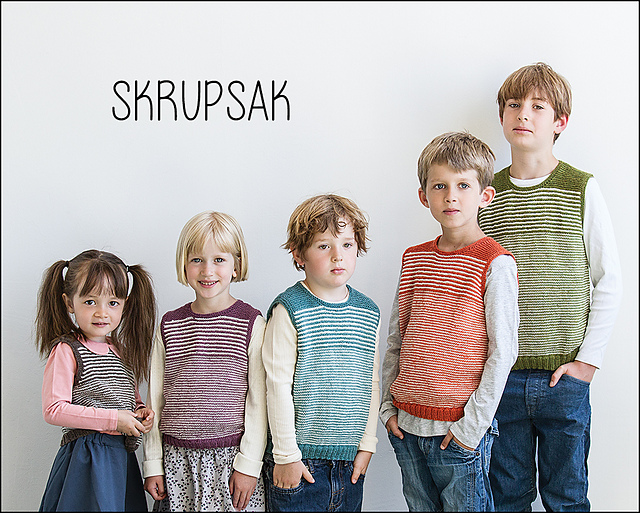
Ww_Skrupsak1_medium2

(Love this shows the design on both boys & girls, in a huge range of colour, and on a variety of ages. BOOM - design statement! )

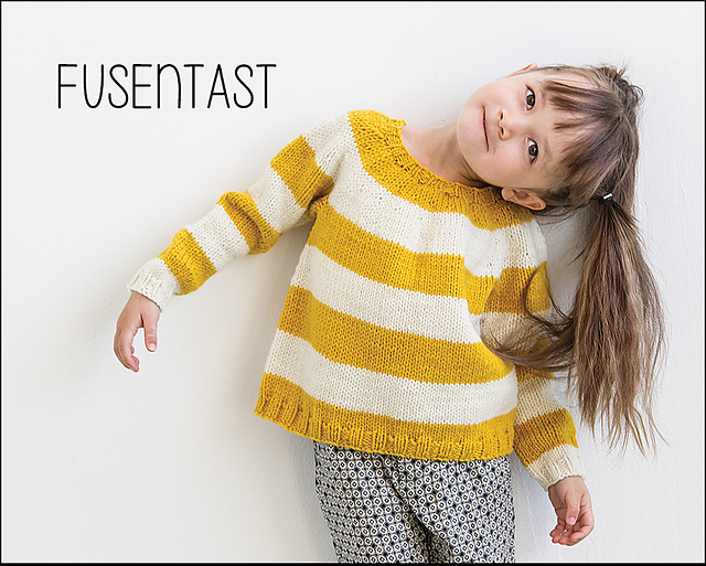
Ww_Fusentast1_medium2

(Love the simplicity and the bold stripes. And the jumper + trousers = YES. I'd wear this.)

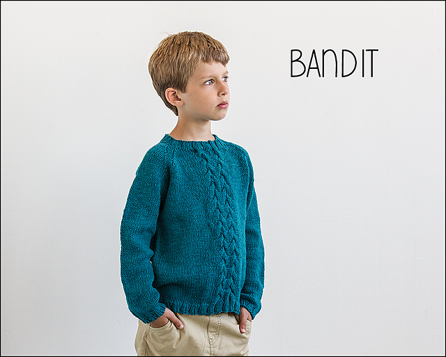
Ww_Bandit1_medium2

(You cannot tell from the smallish photo, but that's an interesting cable detail)

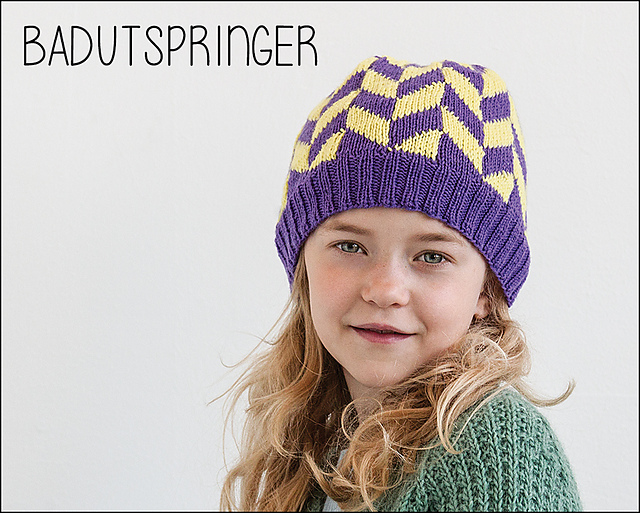
Ww_Badutspringer1_medium2

(This girl takes no prisoners. Also, that hat is so cool that teenagers will secretly sulk that it's for their baby sister or brother)

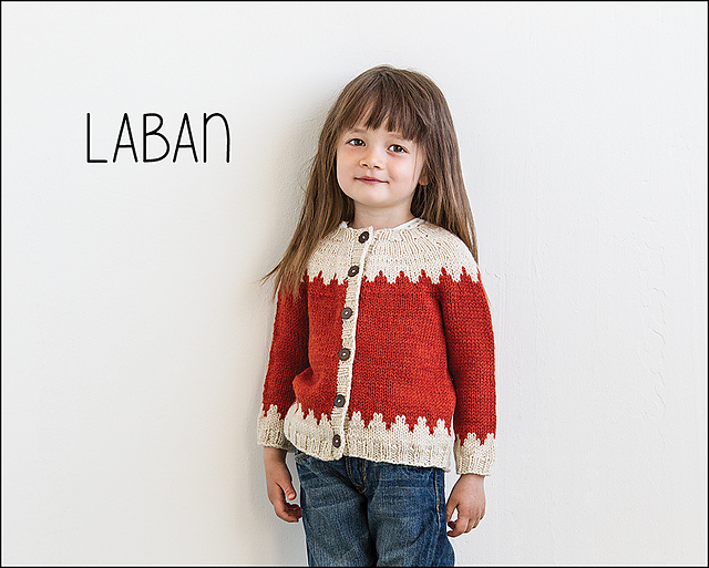
Ww_Laban1_medium2

(I totally love this cardigan. I want it for myself. Again, I love the styling. She looks kick-ass)

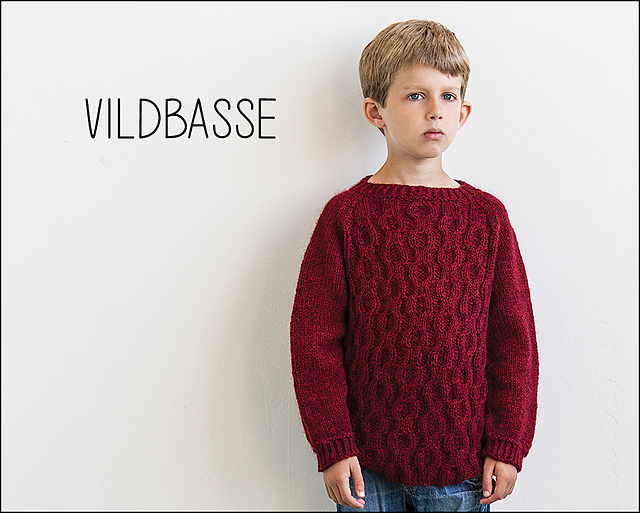
Ww_vildbasse1_medium2

(Aksel gives good face. Incidentally this is knitted in one of my favourite Danish yarns - Håndværksgarn by Hjelholt)

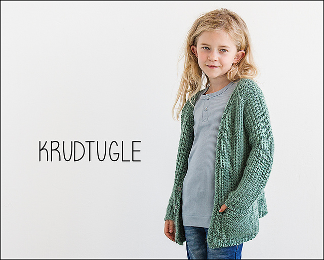
Ww_Krudtugle2_medium2

(Work that pose! Again, totally wearable with clean lines)

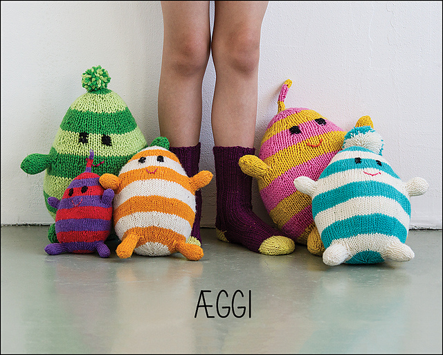
Ww_Aeggi1_medium2

(This is just Signe's design sensibilities in a nutshell)

Knits For Little Scamps is published as a hardback book in Danish - but is available in English on Ravelry as two e-books (KfLS 1 and KfLS 2 - the toy pattern in included in both ebooks).

Congratulations, Signe. You are awesome and I am so proud of you x

(all photos © Signe Strømgaard, 2014)

Stuff & Nonsense: When Perfectionism Rears Its Ugly Head.

August 2014 060The past fortnight has seen my usual companion at Casa Bookish - perfectionism - almost grind my work to a halt. I think a designer needs to have a dash of perfectionism in her. You need to pay close attention to detail - such as stitch counts, style sheets, how colours work at the photo shoot. Designing can also be a long, hard slog of making numbers work, getting the placement of a detail just right and finding the best way to phrase a tricky instruction. But if perfectionism stops you from every accomplishing anything - if your search for perfection means you never release a pattern - then you need to let go.

"That Isn't Exciting & Original" - How Nothing Is Ever Good Enough

Recently I have really struggled to let my perfectionism go. I have one project that I have designed six times and ripped out five times. Each of those six designs has been completely different - different construction, different variation on the core concept, different stitches - and I haven't liked any of them. I do not want to like my design; I want this project to be as amazing, special and perfect as it is in my head; I want to love it like I have loved no other design.

And that's the problem.

Nothing will ever match the perfection that's in my head. I am now working on the sixth version of my idea and it's coming out really nice. Fact: I sold the second design to a third-party publisher who absolutely loved it. It worked for them in their context - it was totally good enough.

So where does all this stuff and nonsense come from?

Figuring Out Why I Am Being Hard On Myself

I spend a lot of time sitting on my own sketching patterns and charting things. I spend even more time in my own head. As a result I tend to lose track of what is exciting and new because I have already thought through my designs several times and spent hours swatching my ideas. It's easy to start talking myself down because at this stage I will have lost sight of what excited me about the original ideas.

Here's the thing that I keep reminding myself:  nobody else will ever be that jaded about my design. No one else have been through the entire process of initial idea and swatching through pattern-writing and wailing about numbers to blocking the sample and arranging photo shoot. No one will ever be able to say anything about my design that I haven't already thought.

I also know that  once the design is finished and published, I will adore it to bits .. because by that stage I will been knee-deep in another pattern that's sucking the will to live out of me! I am only halfway joking..

August 2014 061

So, Some Tips For Moving Beyond Perfectionism

  • Acknowledge to yourself that you have a bad bout of perfectionism. Admitting it is the very first step!
  • Realise that you will always be your own worst critic.
  • It's better to publish something than nothing.
  • Take baby steps. Publish a hat if you are really afraid your latest cardigan pattern isn't good enough.

Some Other Tips:

  • Never throw out a design. What you hate today will look amazing two months from now.
  • If a design really doesn't feel right for what you are doing, consider other ways for it. Would it make a great pattern for a magazine? Self-publishing? Perfect as a freebie included in your news letter? Can you base a class around the pattern - maybe that hat is perfect for teaching Magic Loop.
  • Try playing around with different gauges. If your idea looks silly and stupid in fingering weight, try swatching it in worsted.
  • Reach out to trusted friends and peers. Show them a photo or a swatch. Ask for their honest opinion. Listen carefully to their feedback.

Do you have problems with perfectionism? Does it stop you releasing patterns? How do you deal with it? I'd love to hear your thoughts x

Books & Wool, But Of Course

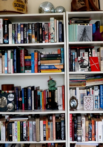
books I gave away about 80% of my books when I left Denmark and I can still see ghosts on the shelves, though I merged my collection with Dave's when we started living together. So many books.

Reading my 2006 blog posts I sounded so cavalier about culling my book collection:

"Red is for never again, never, no, it is so replaceable and it was fun but now the thrill has gone

Yellow is for what a lovely edition, I’ll never find it again and my library wouldn’t be complete without it.

Green is for of course, without a question, it’s part of me and good memories of dear ones.

I may not have a driver’s license but I have many books. I’m putting tiny stickers on their backs: red, yellow, green. So far at least 100 books have been marked with red: Borges*, Jonathan Safran Foer, Ian McEwan, DH Lawrence*, Jane Austen, Thomas Mann* and, er, Marion Zimmer Bradley. The yellow category is the difficult one. Which of Margaret Atwood’s works are yellow and not green? Should I put a bright yellow sticker on John Ruskin or is that a red (because I’m sure there’s a nicer edition out there)?

As I go through my books I realise I’m a flirty reader. I pick up books, break their hearts & spines and drop them cruelly. So many books I never finished: Anita Brookner, Iris Murdoch, James Kelman, Samuel Butler and John Barth. I’m so sorry but it’s not you, it’s me.

And the green books. My friends, my family. Alasdair Gray, Jonathan Coe, AS Byatt, John Donne, Vladimir Nabokov, Philip Pullman, Ezra Pound and EM Forster. I pet you gently and remember when I first encountered you. You are in my blood. You are going nowhere.

*victims of the bad edition rule"

And so we're back to 2014. Still so many books and they are not alphabetised. Fret.

Speaking of books, I am currently reading David W. Anthony's The Horse, the Wheel, and Language: How Bronze-Age Riders from the Eurasian Steppes Shaped the Modern World. It's an interesting look at the Proto-Indo-European language (the ur-language that spawned English, Greek, Hindi, Russian etc) and how PIE is reconstructed following linguistic rules. Anthony also looks at words and concepts that are found throughout the descendants of PIE. Words relating to wagons and wheels, certain types of animals and - relevant to my working life - textiles.

Anthony traces the possible origin* of the word wool - *HwlHn- as PIE contains roots for sheep, ewe, ram and lamb. He argues convincingly that these linguistic fragments point to a domestication of sheep. He also looks at archaeological evidence from Uruk that indicates sheep began being bred for their wool around 3350 BCE. The book then follows the linguistic fragments as they start to spread across the PIE areas. *HwlHn shatters into *Hwel- or *Hwol- .. but the word fragment doesn't always mean "wool". Sometimes it means "to felt", "something made of felt/wool", "to press" or "to weave". Anthony even looks briefly at whorls and spindles. Most of the book is devoted to horses and wheels (as the title indicates) but I did enjoy the dip into textiles. I'm now settling into a section on Neolithic farming in the Caucasus. As you do.

PS. Lots of people have posted pictures of their bookshelves (shelfies?). Do join in!

Tutorial: Creating a Magazine Submission

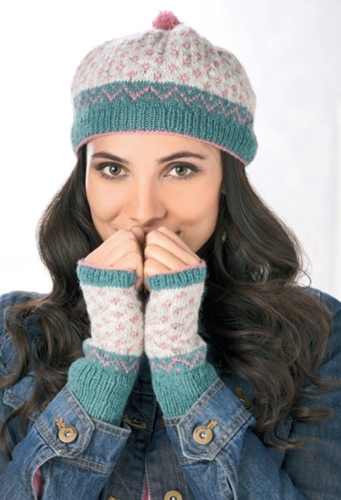
Last year I was lucky enough to get a glimpse into how Sarah Hatton curated The Knit Generation for Quail Publishing and Rowan Yarns. I have also recently helped curate a collection for a knitting company and worked closely with a couple of editors on a sub call. So, in light of all that, I thought it might be interesting to show you one of my successful submissions and discuss in detail how I put together a magazine sub. I don't pretend to have all the answers, of course, but hopefully my experience will be of some help. Recently my Tula hat & gloves set made the cover of UK knitting magazine Let's Knit. The set looks like this (photo courtesy of Let's Knit): karie hat #1
Now let's look at my original submission to the magazine.
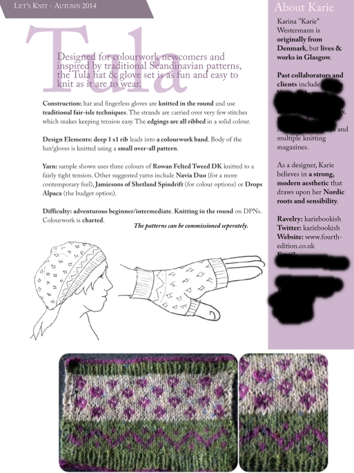
tula

Let's dissect the sub.

tula-crop1-2

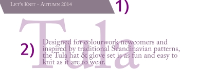
1) I personalised the sub by adding the name of the magazine. Occasionally magazines will give you "stories" or moodboards they want you to use. If that's the case, I will usually add the name of the relevant moodboard to signal that I have thought about my design in a particular context. Let's Knit didn't give me a moodboard to work from, just general guidelines.

2) The name is short, easy to spell and relevant.  I wrote a brief note about the design/design inspiration. I always try to do this in one or two sentences. This brief note should tell the editor(s) exactly what they are looking at.

Next, the details that tell the editors I have thought through the design and who it will appeal to.
tula-crop-3-6

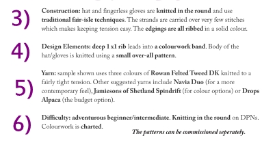
3) The section on construction is very important to tech editors. They will look at whether the designer has thought through the actual making of the piece(s). Nobody wants to commission a piece which the designer realises is impossible to make three weeks before deadline.

4) Depending upon the type of swatch and my lead-in sentences (2), I sometimes skip the design elements. However, it is useful to give an actual description of the piece(s) and this will help the editors when writing about the piece in the magazine as they may not have photos of the item handy when they write about them.

5) The yarn suggestion section is often really fun to compile, but I make sure the yarn suggestions are a) available in the country of the publication, b) they are current yarns and c) they are relevant to the actual project (i.e. not just stuff I think it'd be fun to use). My Tula swatch was knitted in Rowan Felted Tweed which has beautiful drape and comes in 29 colours. It is a sportweight which meant I could actually dip into 4ply or light DK when  it came to making substitutions. I selected Jamiesons of Shetland Spindrift (4ply) and Drops Alpaca (sportweight) as possible substitutions - both have beautiful drape and great colour ranges. Let's Knit loved my idea of using Jamiesons - and I loved using it. Note that I am not making any colour suggestions! The editors often work to colour stories and will liaise with me to make sure my design fits into their stories.

6) Difficulty level simply shows that I have considered who might want to knit my design. Tula is charted and is knitted in the round - this coupled with gentle colourwork says that it will not appeal to absolute beginners but may be an aspirational knit for adventurous beginners or intermediate-level knitters. Again, I am also considering the publication and its target audience. Knitters are not a homogeneous bunch nor are magazines!
tula-crop7

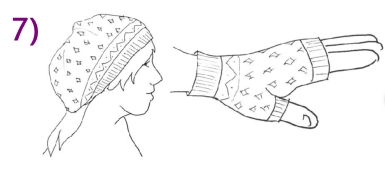
7) Sketch of fit. I want this to show how the hat sits on the head of the wearer and the shape of the fingerless mitts. I know sketching is hard for some people, but you can trace fashion models (like this tutorial tells you) and there are many free tracing models out there.  The more you practice, the better you will get. Remember: if doesn't matter if your model only has three fingers and she squints if your sketch communicates how a hat fits!
tula-crop8

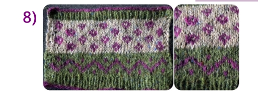
8) However, the swatch is very, very important. The swatch is where the entire story is told, really. My swatch needs to be relatively big (4" by 4" or preferably bigger), blocked, and incorporating all the important elements. Here you can see Tula's one-row cast-on and cast-off in a contrast colour, the 1x1 rib and both colourwork patterns (and how they call back to each other). The photo was taken in daylight near a window (so all details are clear) and I photographed the swatch on a neutral background. Sometimes I take a series of photos of details like beading or a particular stitch pattern and I put them next to the main photo - but only if they are important to the story. tula-crop9a 9) Finally, the bit where I tell editors about me. Quick intro to my background, a paragraph about clients and collaborators, a note about my personal design aesthetic, and finally how the editors can get hold of me including my home address so the editors can send me yarrrrn.The design is way more important than me, so I'm in the margins!
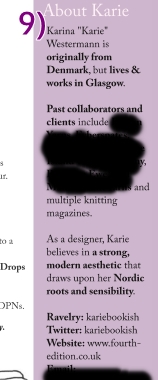
(I know not everybody has a portfolio full of client and collaborators - but I think of the Ravelry project page as an online portfolio (I got my first big break in the knitting industry after someone had seen my project page, actually) and I always check out what people have been knitting. Someone may not have many designs to their names but they may have a project page full of stunning work where they reveal a real sense of colour.)

I spell-check before turning my single A4 page into a PDF (I don't want to write nkitting and nedles - tech editors will worry I cannot format a pattern!). Note that I have chosen to use colours in my layout - I change these colours for every sub I compile so they reflect the colours used in my swatch. Partly it's because I am OCD about colour but also partly because my choice of colour/layout is part of the story I am telling with my sub. You can also see I choose to semi-bold keywords which makes life easier for a busy editor.

And there you have it - the sub I compiled for Tula. I hope this has been useful in showing you just how much information I try to  include and how I try to make the editors' decision-making easier. This is definitely not the only or right way of making a submission - remember you want to be telling your own story in your own voice!

However, if you have any questions, please do ask and I'll compile/answer them in a future post.